Material-UIシリーズ第三回は文字のスタイルをあれこれいじってみたいと思います。 SVGアイコンを表示したり、テキストを様々な形で表示します。
アイコン
Googleが提唱するMaterial Iconsを利用できます。 Webフォントを使った表示方法や、外部のCSSを動的に読み込んで表示する方法などあるようですが、今回はSVGアイコンを表示する機能を使ってみます。
追加インストール
@material-ui/core以外の機能を使うには必要なモジュールを別途インストールする必要があります。今回は@material-ui/iconsを入れます。カレントディレクトリをプロジェクトのディレクトリに移動しnpm installします。
$ npm install @material-ui/icons
使ってみる
まずは以下のページから利用したいアイコンを選びます。ここではalarmを表示してみます。
https://material.io/tools/icons/?style=baselinematerial.io
大抵の場合、アイコン名の先頭を大文字にすればimportすべきファイルが存在します。 これがそのままコンポーネントになってますので、使いたいところで呼び出せば利用できます。簡単ですね。
import React, { Component } from 'react';
import AlarmIcon from '@material-ui/icons/Alarm';

class App extends Component {
  render() {
    return (
      <AlarmIcon />
    )
  }
}

export default App;
色
color属性で色を指定することができます。色と言っても赤とか青など具体的な色名ではなく、意味付けを行うものです。
import React, { Component } from 'react';
import AlarmIcon from '@material-ui/icons/Alarm';

class App extends Component {
  render() {
    return (
      <div>
        <AlarmIcon color="inherit" />
        <AlarmIcon color="primary" />
        <AlarmIcon color="secondary" />
        <AlarmIcon color="action" />
        <AlarmIcon color="error" />
        <AlarmIcon color="disabled" />
      </div>
    )
  }
}

export default App;
実行結果は以下の通り。
 ※ブラウザの機能で大きくしています。
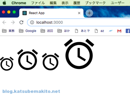
サイズ
アイコンの大きさはfontSize属性で指定します。defaultは24pxとのこと。
import React, { Component } from 'react';
import AlarmIcon from '@material-ui/icons/Alarm';

class App extends Component {
  render() {
    return (
      <div>
        <AlarmIcon fontSize="inherit" />
        <AlarmIcon fontSize="default" />
        <AlarmIcon fontSize="small" />
        <AlarmIcon fontSize="large" />
      </div>
    )
  }
}
export default App;
実行結果は以下の通り。
 ※ブラウザの機能で大きくしています。
Typography
ここからはテキスト情報を様々な形で表示する方法について触れてみます。
Roboto Fontの導入
必須ではないのですが、Googleが提唱するマテリアルデザインで利用が推奨されているフリーのフォントがあります。Googleが制作した物でAndroidやChromeOSなどにプリインされているようです。
インストールは簡単で、プロジェクトのディレクトリに移動しnpm install。
$ npm install typeface-roboto
利用するには必要なJSでimportするだけです。
import 'typeface-roboto';
使ってみる
Typographyはテキストを様々な形で表示する際に用いるコンポーネントです。
例えば以下のコードでは、最終的にHello Material-UI.
h1用のCSSが適用されます。
import React, { Component } from 'react';
import Typography from '@material-ui/core/Typography';
import 'typeface-roboto';      // Roboto Fontを利用しない場合は削除

class App extends Component {
  render() {
    return (
      <Typography component="h2" variant="h1">
        Hello Material-UI.
      </Typography>
    );
  }
}

export default App;
このように単純にテキストをはさみ、最終的に出力するHTML(コンポーネント)と、表示用のスタイルを指定します。
variantの種類
valiant属性で指定できる値は次の通りです。見出しやサブタイトル、本文、ボタンなど多岐に渡りますね。
<div>
  <Typography variant="h1" gutterBottom>Hello Material-UI.</Typography>
  <Typography variant="h2" gutterBottom>Hello Material-UI.</Typography>
  <Typography variant="h3" gutterBottom>Hello Material-UI.</Typography>
  <Typography variant="h4" gutterBottom>Hello Material-UI.</Typography>
  <Typography variant="h5" gutterBottom>Hello Material-UI.</Typography>
  <Typography variant="h6" gutterBottom>Hello Material-UI.</Typography>
  <Typography variant="subtitle1" gutterBottom>subtitle1. Hello Material-UI.</Typography>
  <Typography variant="subtitle2" gutterBottom>subtitle2. Hello Material-UI.</Typography>
  <Typography variant="body1" gutterBottom>body1. Hello Material-UI.</Typography>
  <Typography variant="body2" gutterBottom>body2. Material-UI.</Typography>
  <Typography variant="button" gutterBottom>button</Typography>
  <Typography variant="caption" gutterBottom>caption</Typography>
  <Typography variant="overline" gutterBottom>overline</Typography>
</div>
gutterBottom属性をつけるとコンポーネントの下部にマージンをつけてくれます。
ブラウザでプレビューした結果は以下の通り。

実際に出力されているHTMLは次のようになります。component属性を指定せず、variant属性のみを用いた場合、イメージ通り素直に出力してくれるのがわかります。

色
color属性で色を指定することができます。アイコンと同様にこちらも具体的な色名ではなく、テキストに対して意味付けを行います。
<div>
  <Typography variant="h3" color="default" gutterBottom>default. Hello Material-UI.</Typography>
  <Typography variant="h3" color="error" gutterBottom>error. Hello Material-UI.</Typography>
  <Typography variant="h3" color="inherit" gutterBottom>inherit. Hello Material-UI.</Typography>
  <Typography variant="h3" color="primary" gutterBottom>primary. Hello Material-UI.</Typography>
  <Typography variant="h3" color="secondary" gutterBottom>secondary. Hello Material-UI.</Typography>
  <Typography variant="h3" color="textPrimary" gutterBottom>textPrimary. Hello Material-UI.</Typography>
  <Typography variant="h3" color="textSecondary" gutterBottom>textSecondary. Hello Material-UI.</Typography>
</div>
デフォルトでは以下の通り。

配置
align属性でセンタリングや右寄せなど文字の配置を行うことができます。
<div>
  <Typography variant="h3" align="inherit" gutterBottom>inherit. Hello Material-UI.</Typography>
  <Typography variant="h3" align="left" gutterBottom>left. Hello Material-UI.</Typography>
  <Typography variant="h3" align="center" gutterBottom>center. Hello Material-UI.</Typography>
  <Typography variant="h3" align="right" gutterBottom>right. Hello Material-UI.</Typography>
  <Typography variant="h3" align="justify" gutterBottom>justify. Hello Material-UI.</Typography>
</div>
実行結果は以下。justify(均等割付)効かないのかな?


")